The project.
Generating lasting sales.
Teneo Results is a sales performance company specialized in strategic sales training and coaching. Tasked with rebranding their company, we incorporated components of the Teneo sales philosophy into our brand process. The result was a bold new client focussed brand that is instantly recognizable and captures the Teneo spirit.
Brand strategy
Brand identity
Brand messaging
Graphic design
Web Design
 |
|---|
001
Logo design.
The Teneo rings represent the four stages of selling. They also represent the layers of a collective sales eco-system within an organization. Each ring and respective space bare the exact same weight — a reflection of the balanced values across a sales organization. The overall bullseye shape represents sales targets and serves as a strong mnemonic design device.
From a scale and proportion perspective, the ‘O’ in TENEO can also be replaced with the icon as a future option.


002
Typography & Colour.
A simplified type and colour structure was key in the minimalist design strategy developed. This facilitated Teneo’s ability to independently develop their own training materials. It also triggered stonger brand recognition.
 |
|---|
003
Website design.
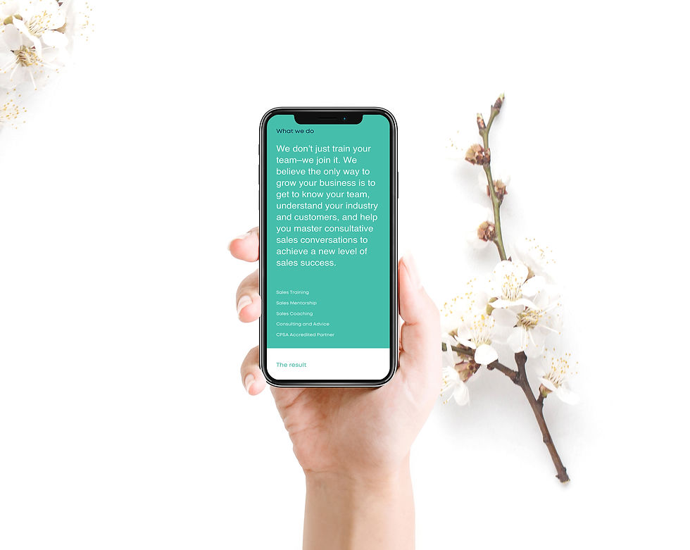
We took a unique word-of-mouth approach to designing the Teneo homepage. Unlike other sales training companies, Teneo is known for their continuous long-term sales growth achieved through long-term client relationships. While Teneo takes pride in their results, their clients seem to be prouder. Capitalizing on their client relationships, we prominently feature their clients on the homepage—providing validity to their tremendous sales results.

BOLD CLIENT FEATURE. Top executives proudly stand for their belief in Teneo's results.
SALES & SEO FRIENDLY MESSAGING. Site copy was structured to condense all key messaging into short 1-2 line messages—helping speed of read while creating a better SEO type structure.
CLIENT FIRST LANGUAGE. Messaging was meticulously crafted to target both short- and long-term client needs. Using only 3 short one-liners, key results are instantly understood—even if users fail to read the full text.
LEVERAGING PARTNER STATUS. Teneo is just one of a small few companies serving as CPSA partners.
DESIGN, MEET PROCESS. Iconic Teneo rings are used throughout the website and collateral as both a design cue and interactive tool. Here, we feature the training process.
SIMPLE FORMS, STRONG RESULTS. Simplified form structures with a "Tell us about yourself" feature helps vet out potential clients.

004
Book design.
Templates and concept samples for the Purposeful Sales Strategy Guides, Workbooks, Sales Performance Tracker and Notebooks were created.
 |  |  |
|---|
005
Stationery design.
The Teneo rings are leveraged across all customer touch-points. The business cards feature a unique concept. Each card bares 1 of 6 different designs. When placed together, they form a complete ring, representing teamwork.
 |  |  |
|---|---|---|
 |  |  |
 |  |
006
Signage/Environmental.
The iconic rings were designed to work across all mediums on any colour. They worked especially hard architecturally. When blended with soft neutral colours, the colour palette shines—creating a distinctly branded environment that is easy to live with.
 |  |
|---|


